


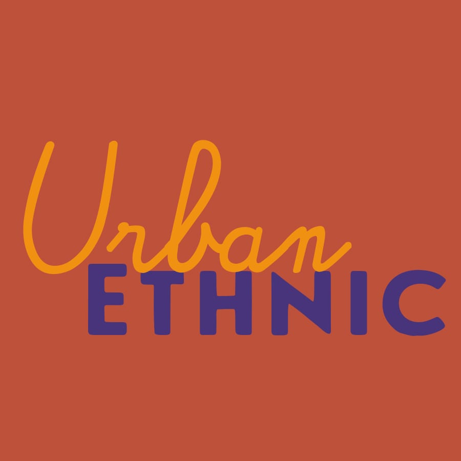
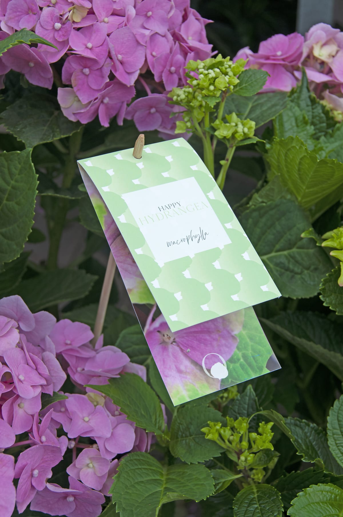
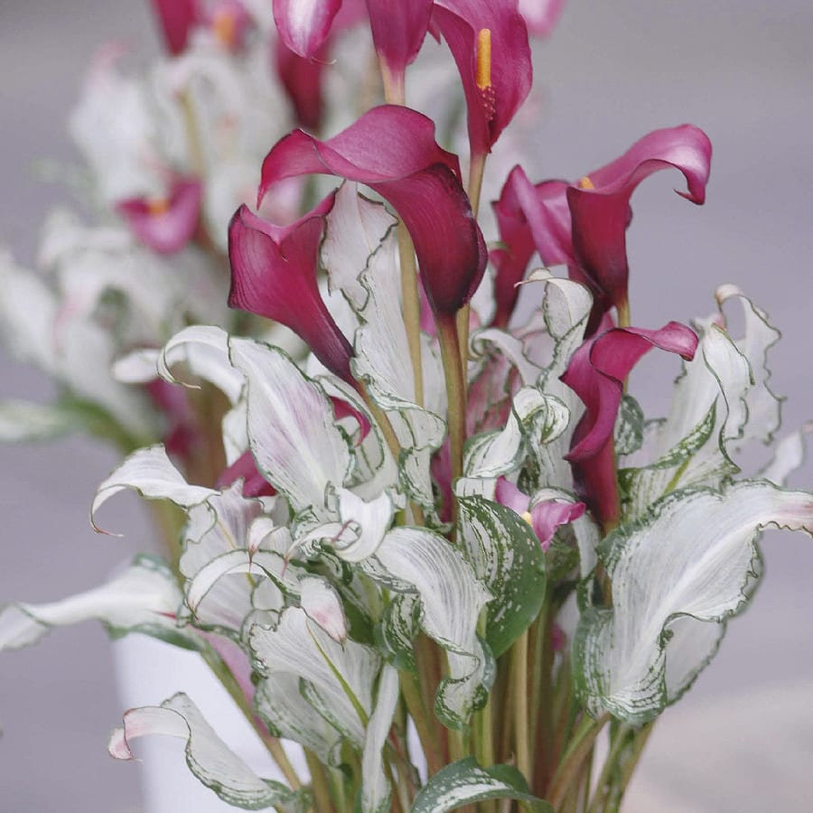
Urban Etnic
December 2019
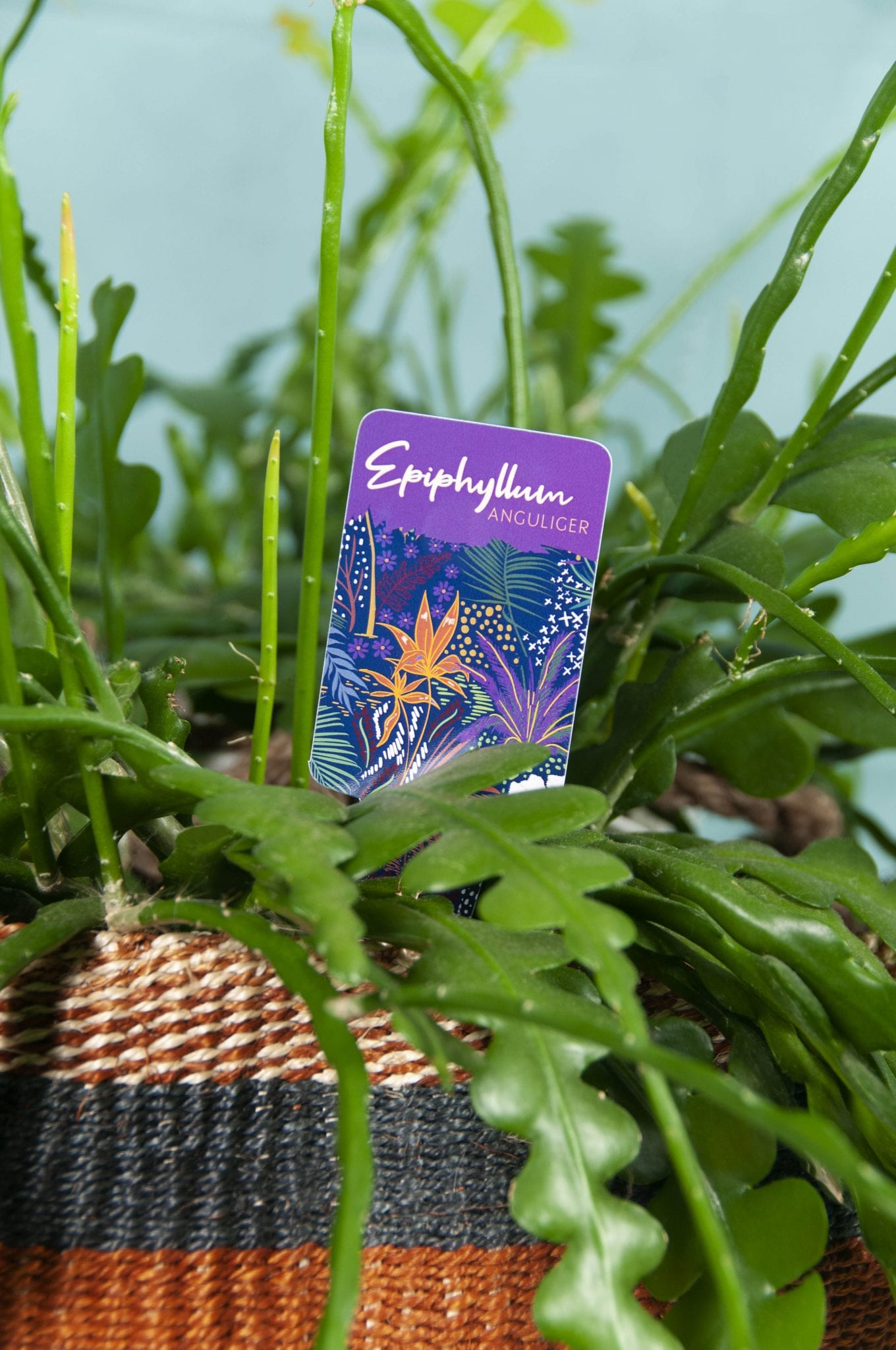
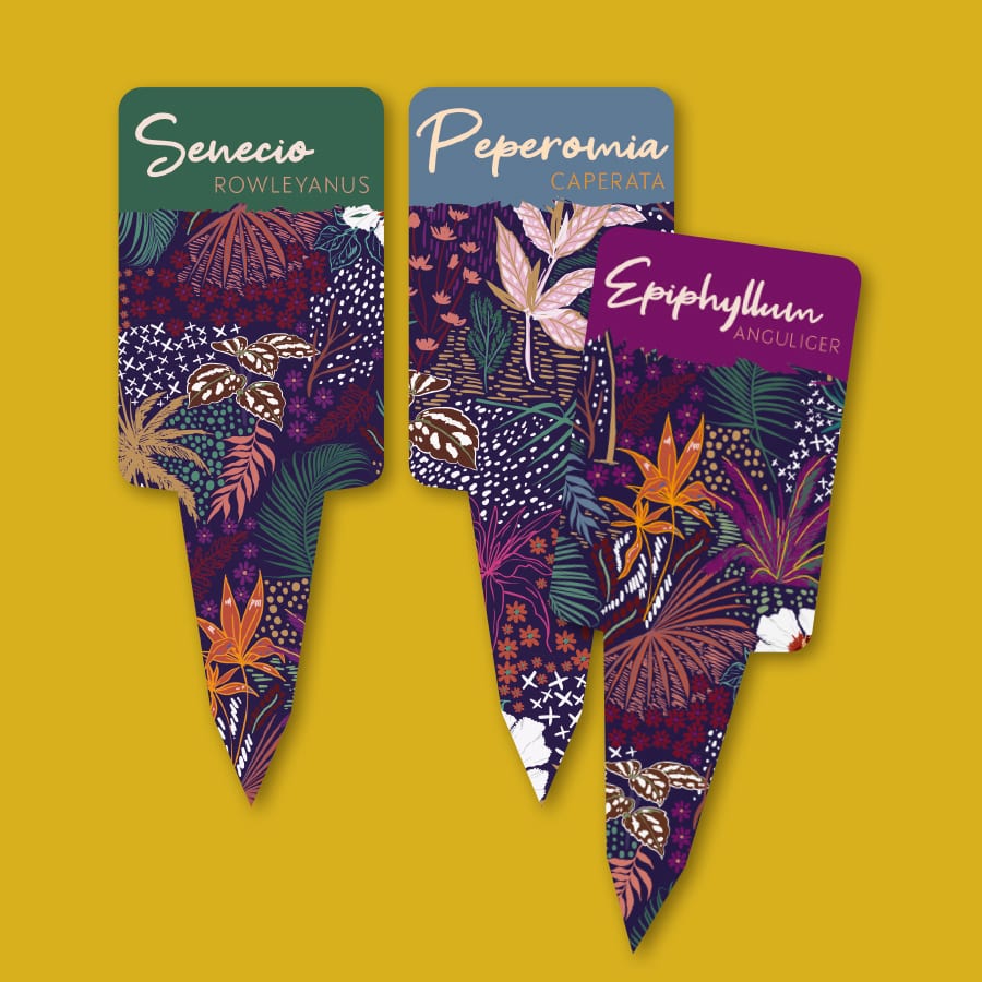
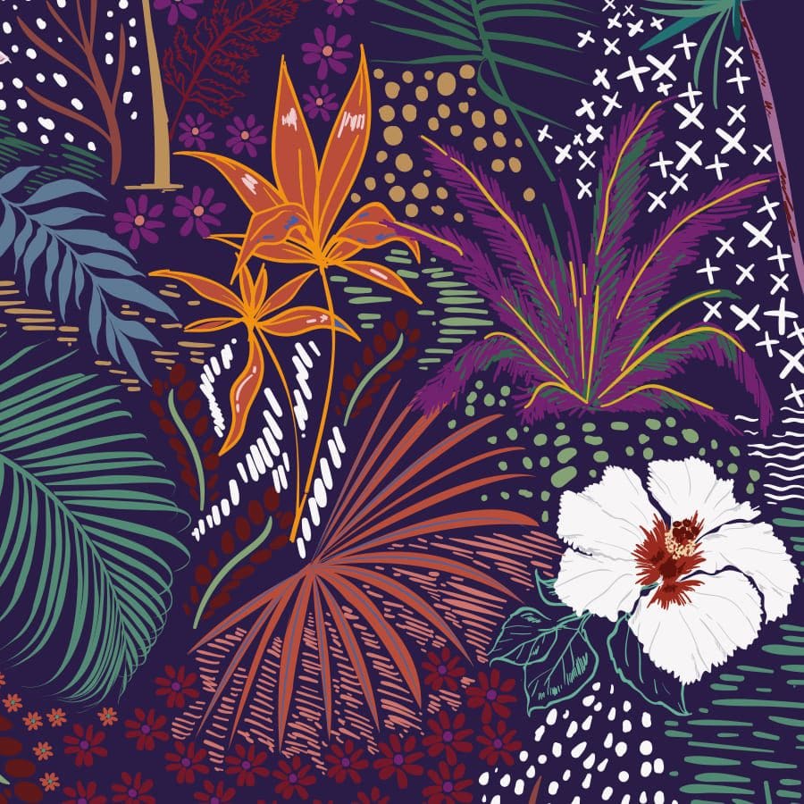
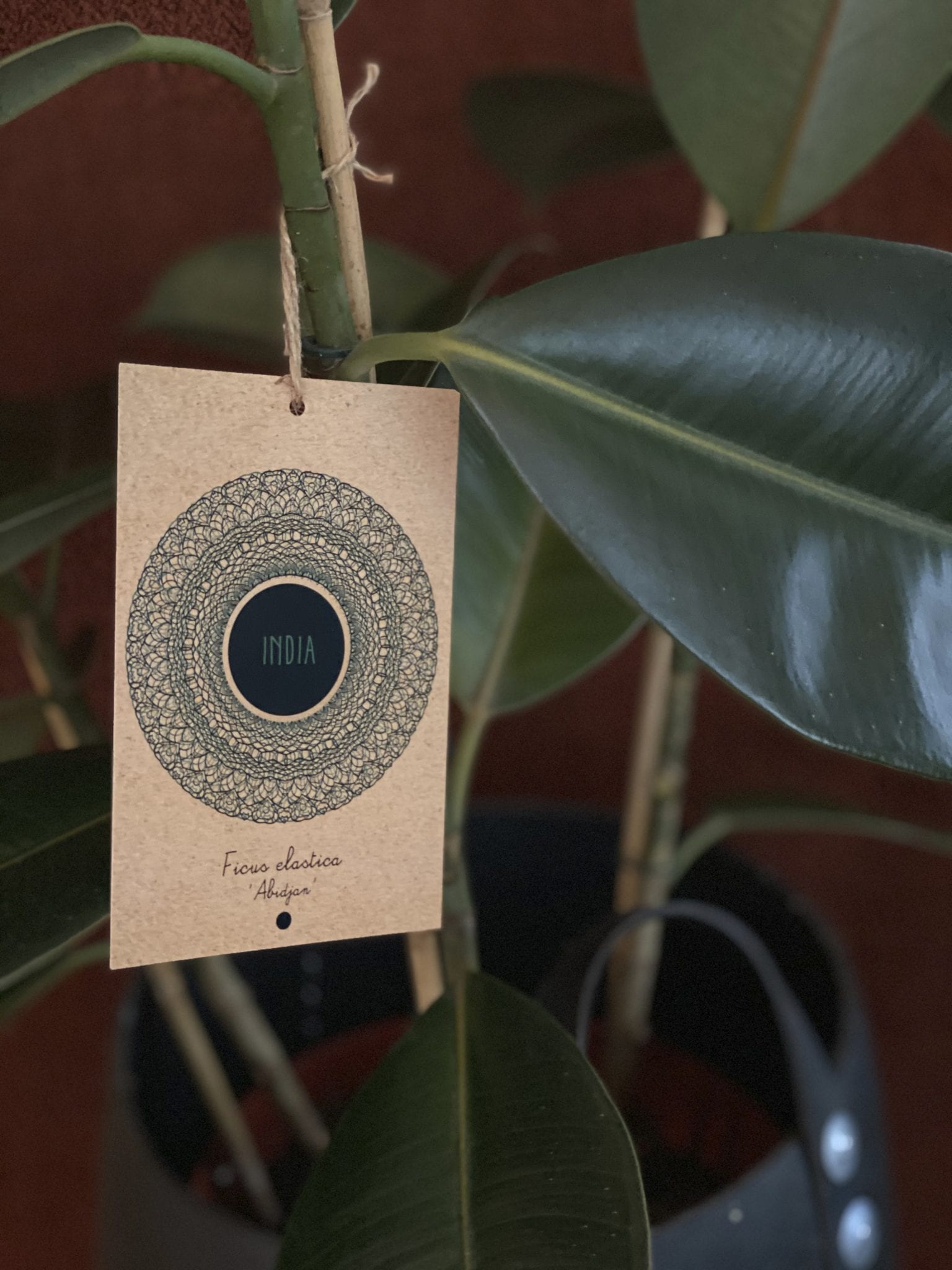
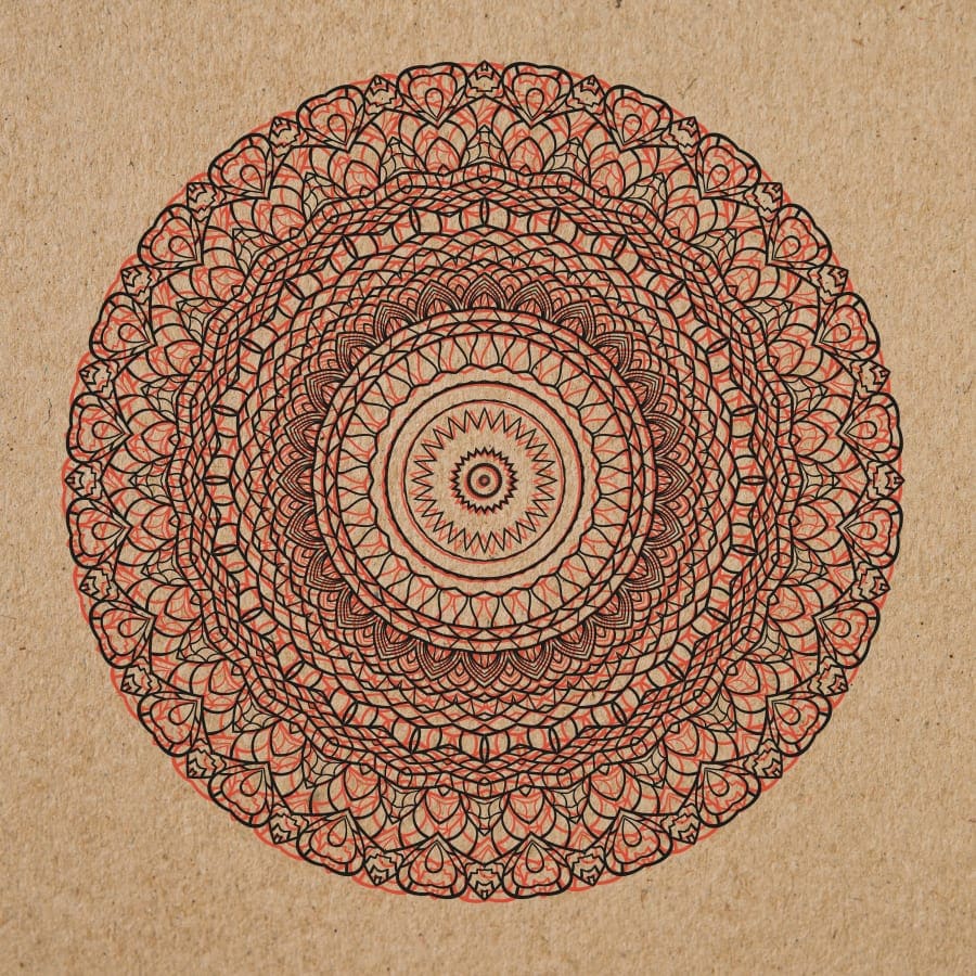
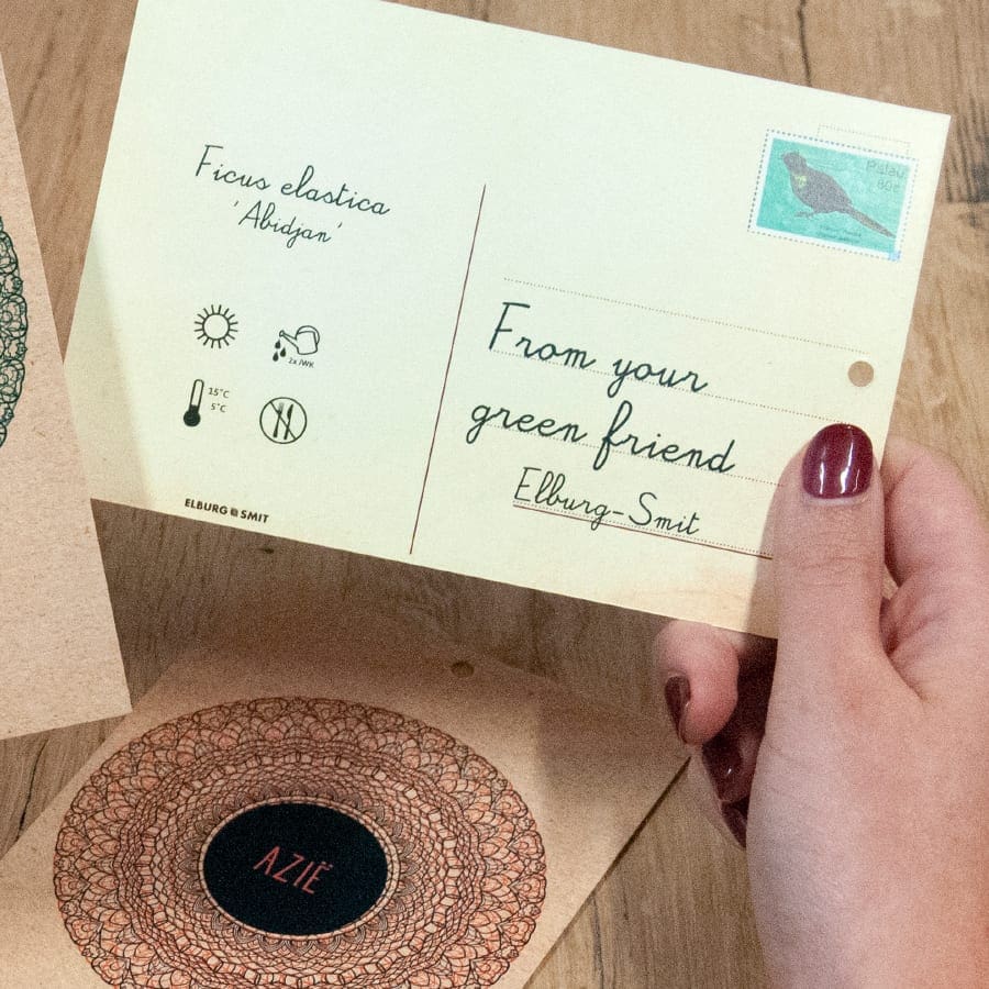
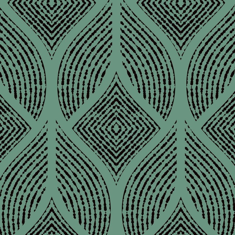
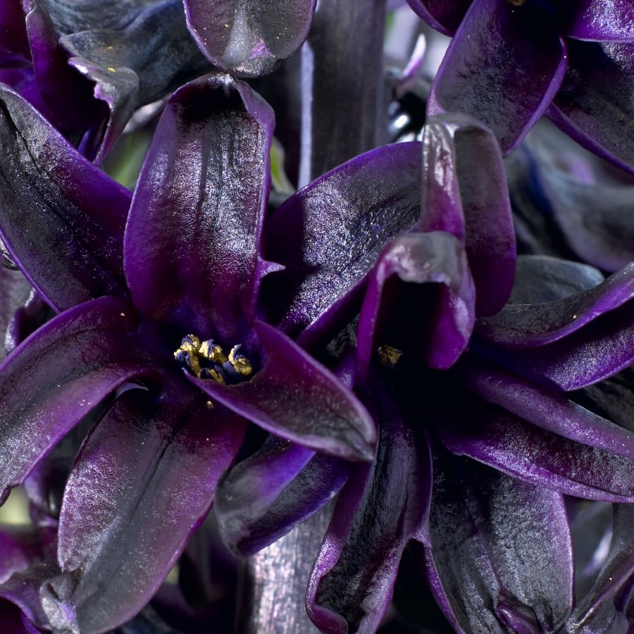
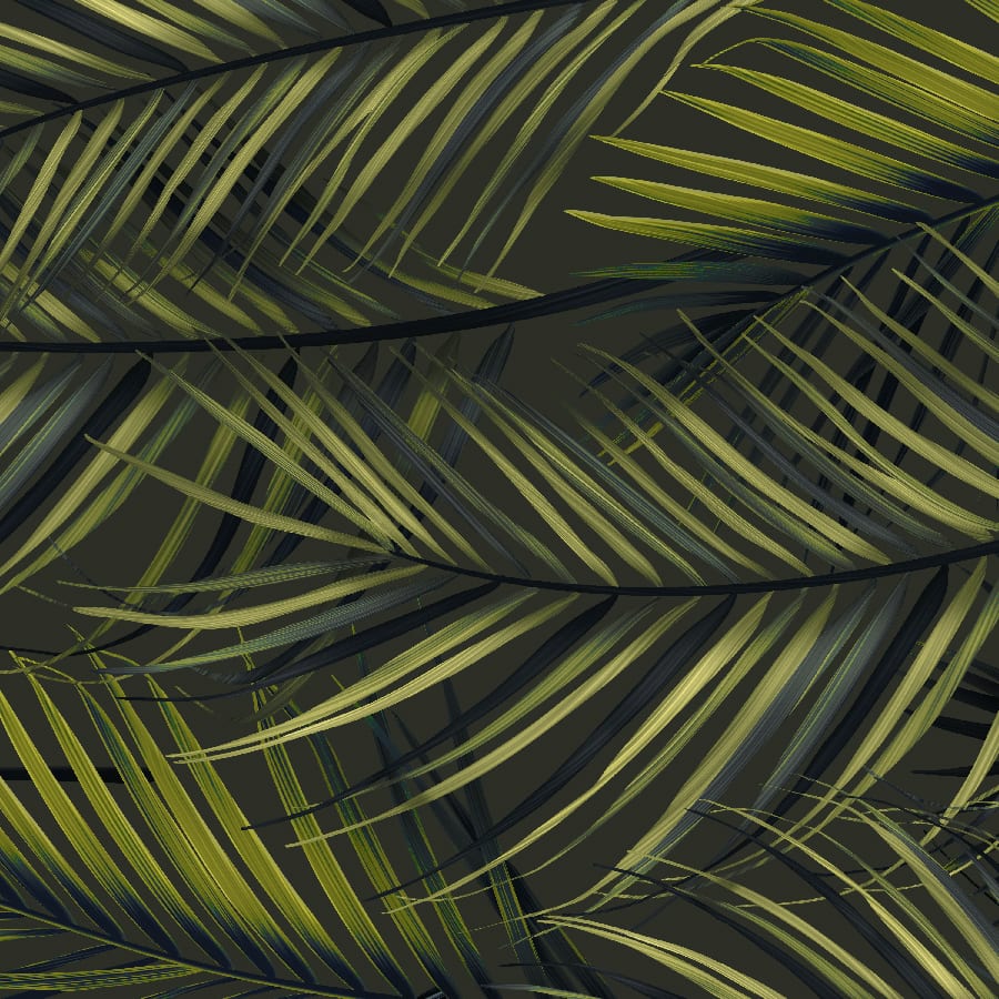
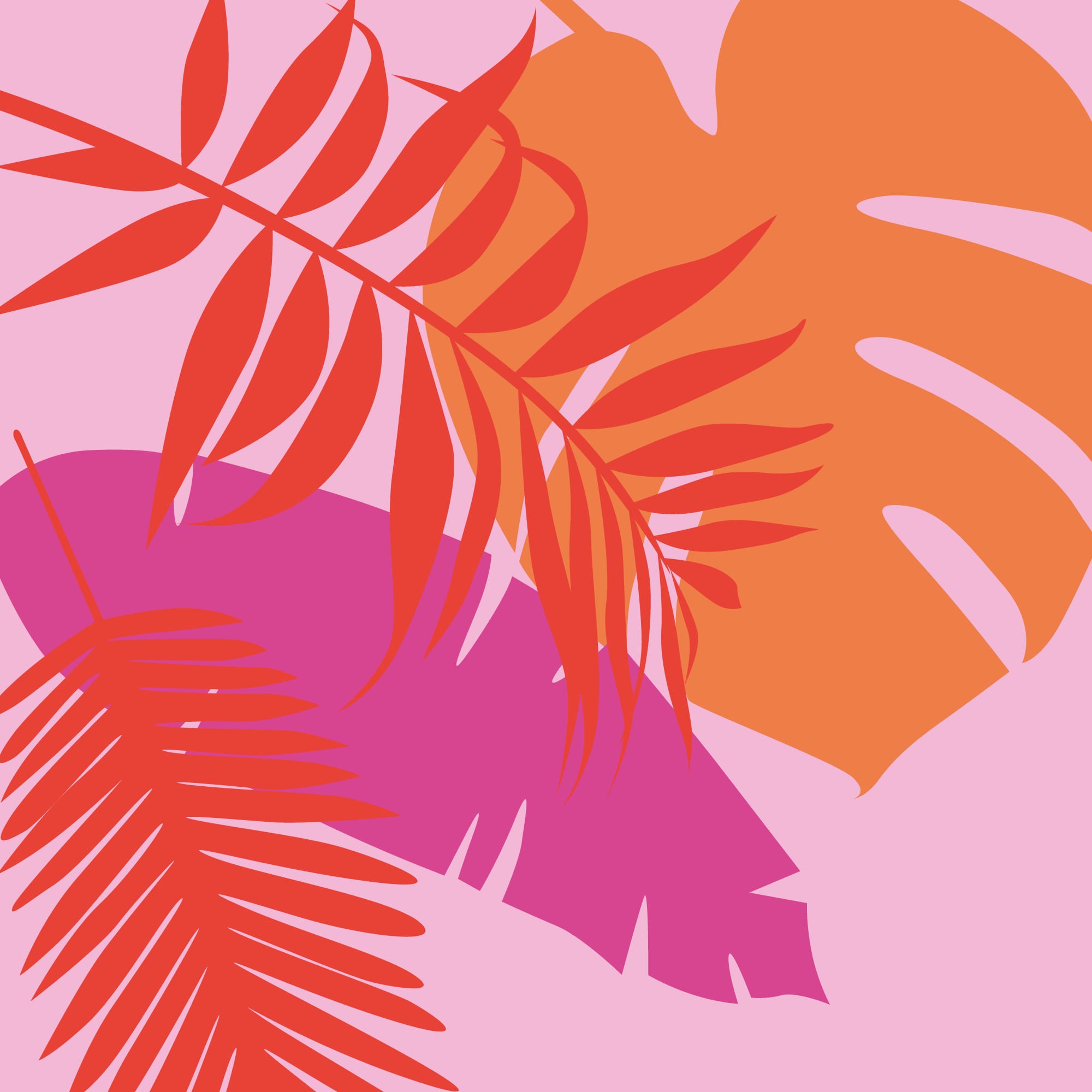
Our fourth and final style theme for 2019 is called ‘Urban Ethnic’. Winter, especially the festive month of December, is the most wonderful time of the year. It means spending time with family and friends and ringing in the new year ahead.
The colours were inspired by dark days paired with natural and vibrant earth tones, which results in surprising combinations. The design and packaging ideas feature ethnic line drawings and large, whimsical floral and leaf motifs. Organic shapes and soft, natural materials form the basis of this theme. This style theme rounds off the warm, festive look with botanical green. Let our winter theme inspire you!

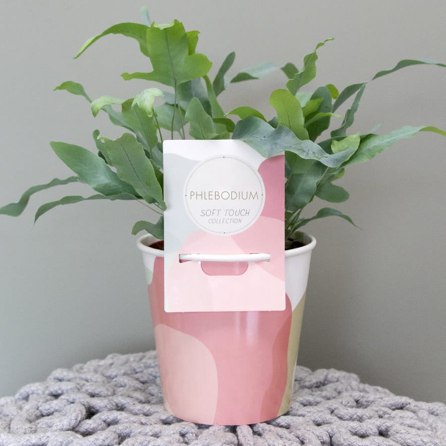
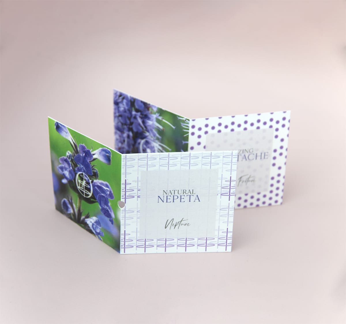
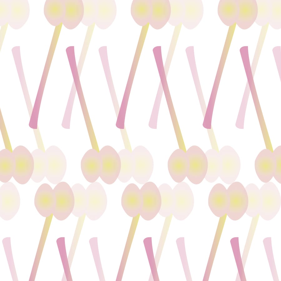
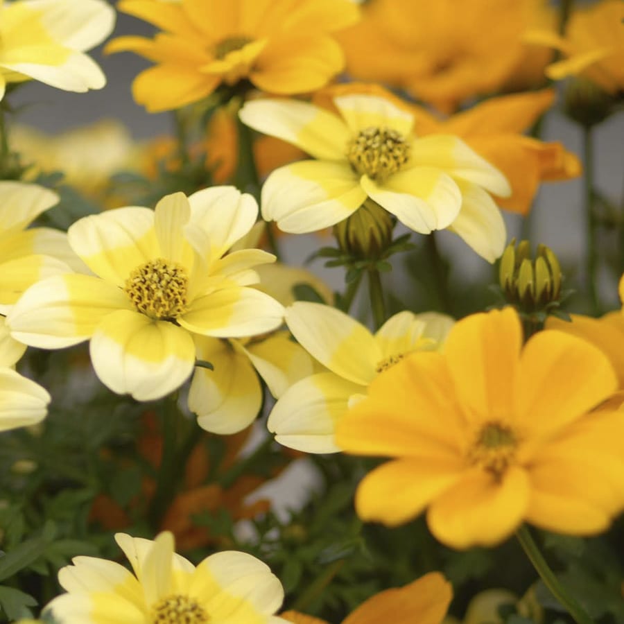
Soft Nature
September 2019
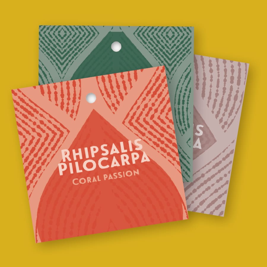
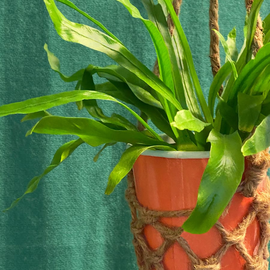
Following the ‘rich’ Gold Delicious, we now look at the soft and modest style theme titled ‘Soft Nature’.
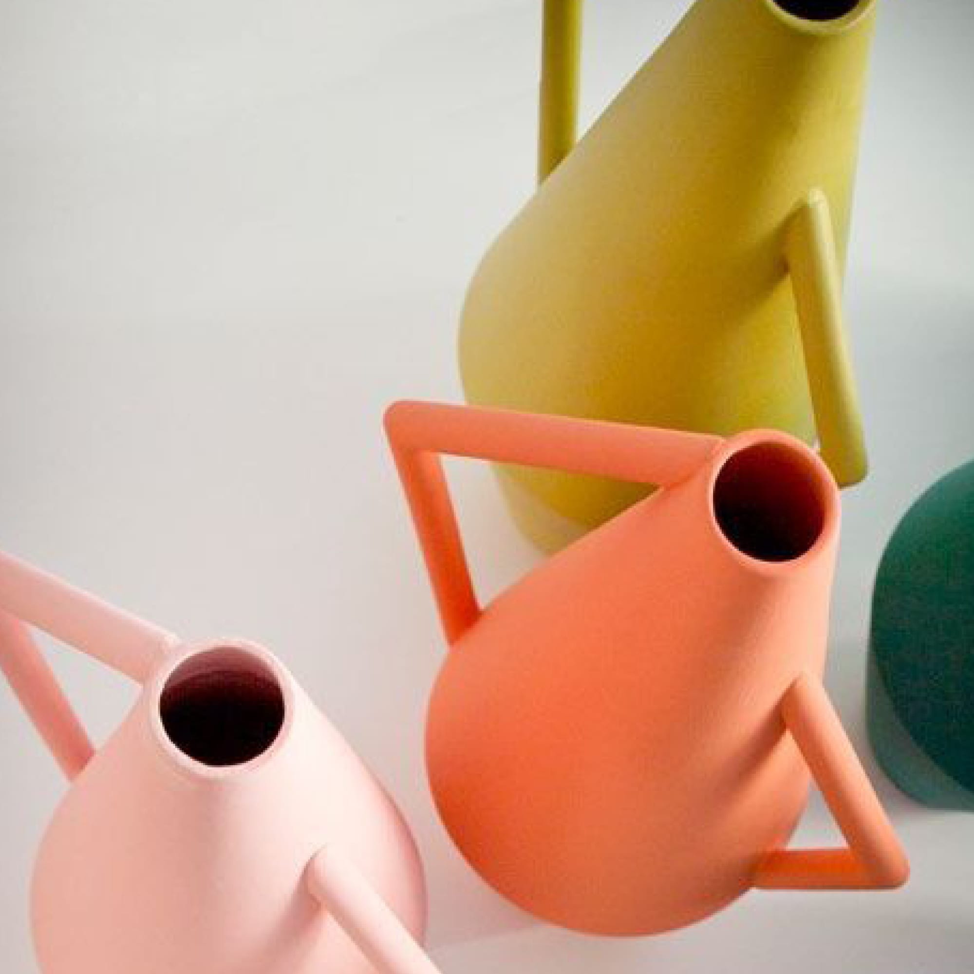
The colour scheme offers a sense of refinement and subtlety, with blush shades, a dark shade of brown, and earthly grey shades in combination with the Pantone colour of the year for 2019: living coral.
The soft shapes of the botanical designs add an element reminiscent of paintings in many of the designs. This theme has a number of natural design elements that you can use in many combinations, resulting in endless potential for variation. Be inspired!
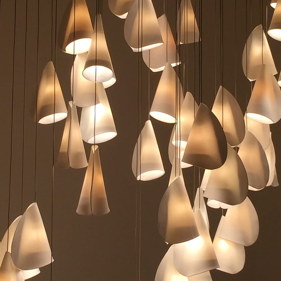
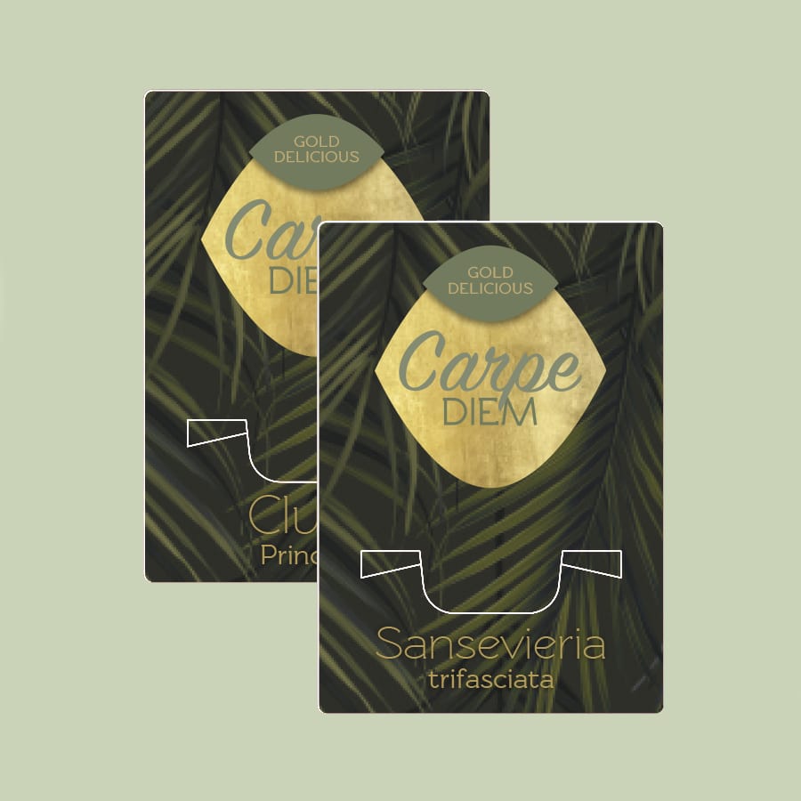
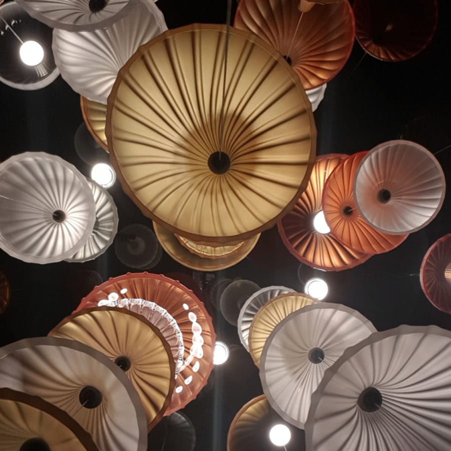
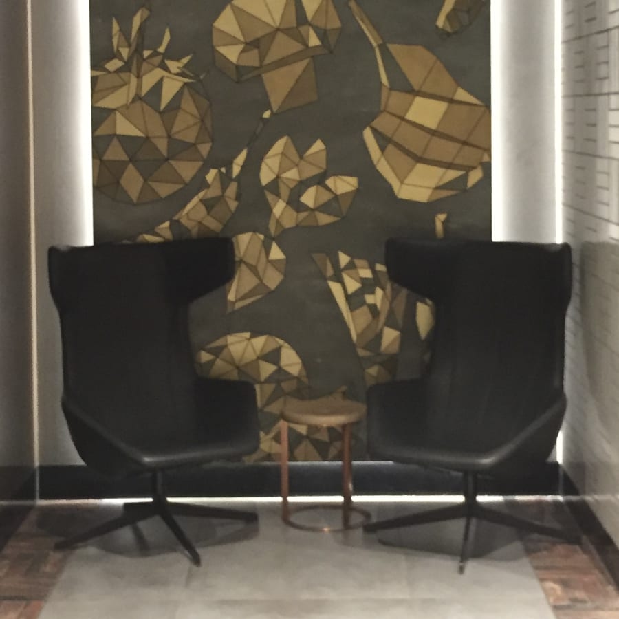
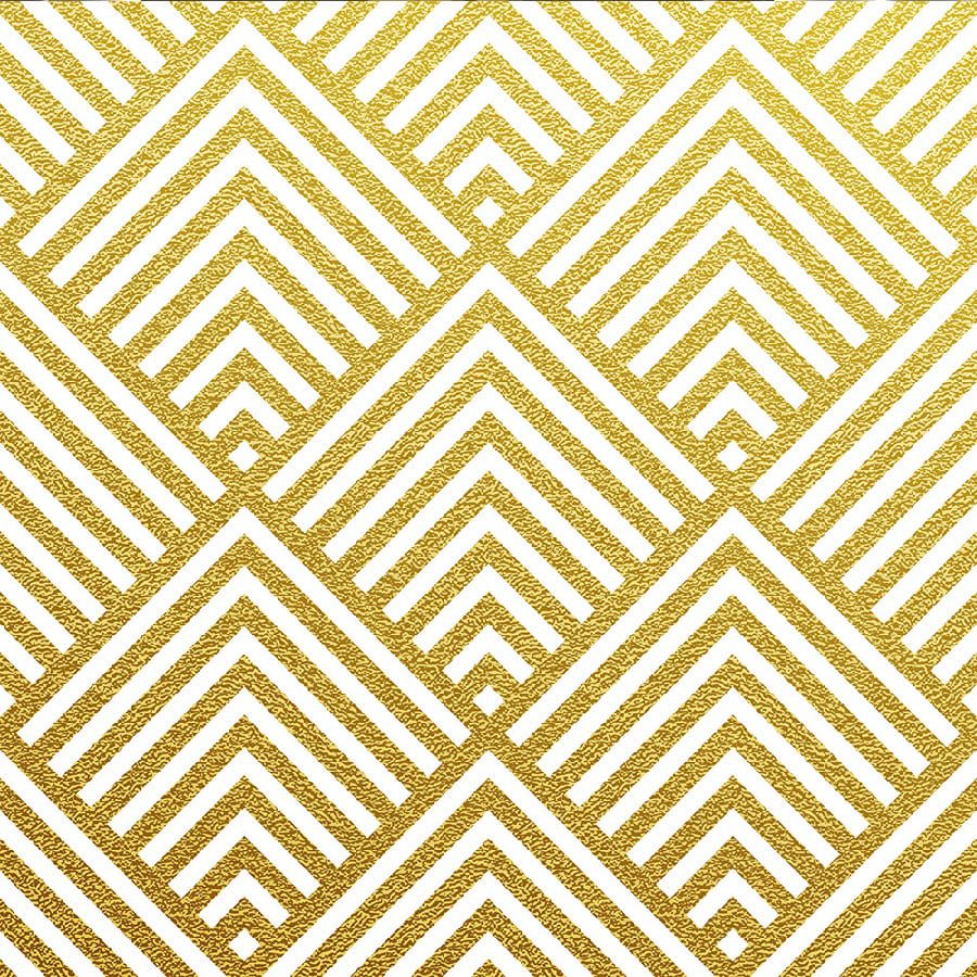
Gold delicious
June 2019
Our second style theme ‘Gold Delicious’ contains high-quality materials in rich, deep colours with warm and summery gold accents.
The theme produces a luxurious, nostalgic look with an understated allure. These design and packaging ideas feature stylized designs inspired by the timeless Art Deco movement, with a range of arched shapes, soft and cuddly fabrics, and a combination of materials such as marble, brass, and brushed steel.
This style theme rounds off the beautiful, luxury look with the warm colours of botanical green. Be inspired!
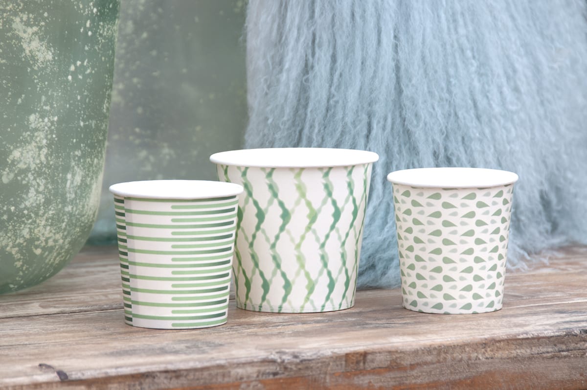
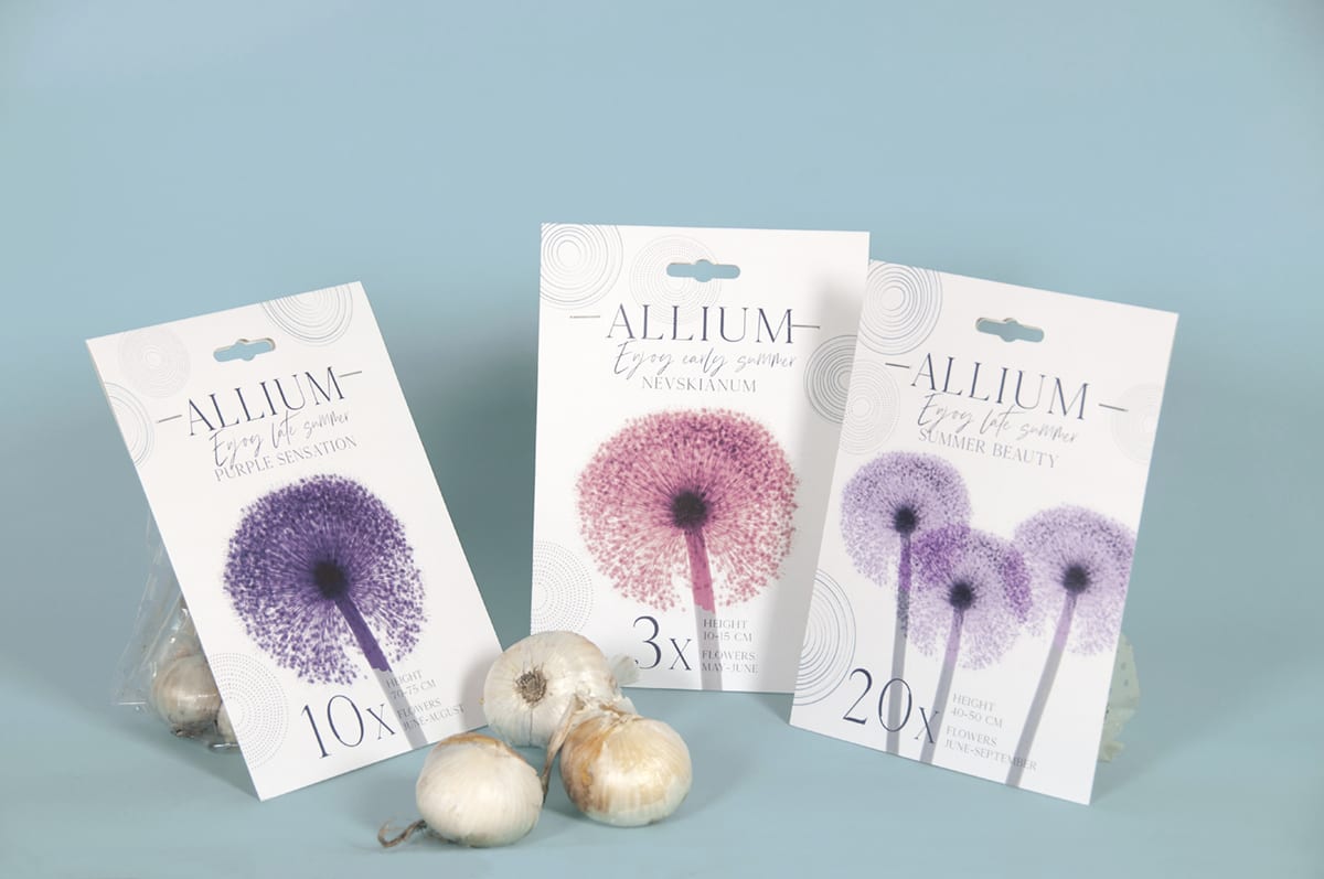
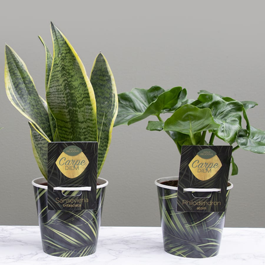
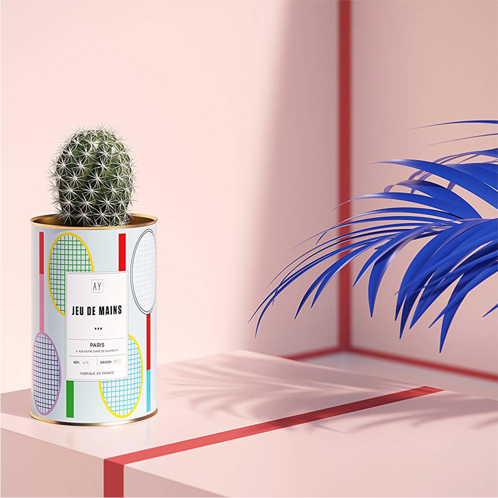
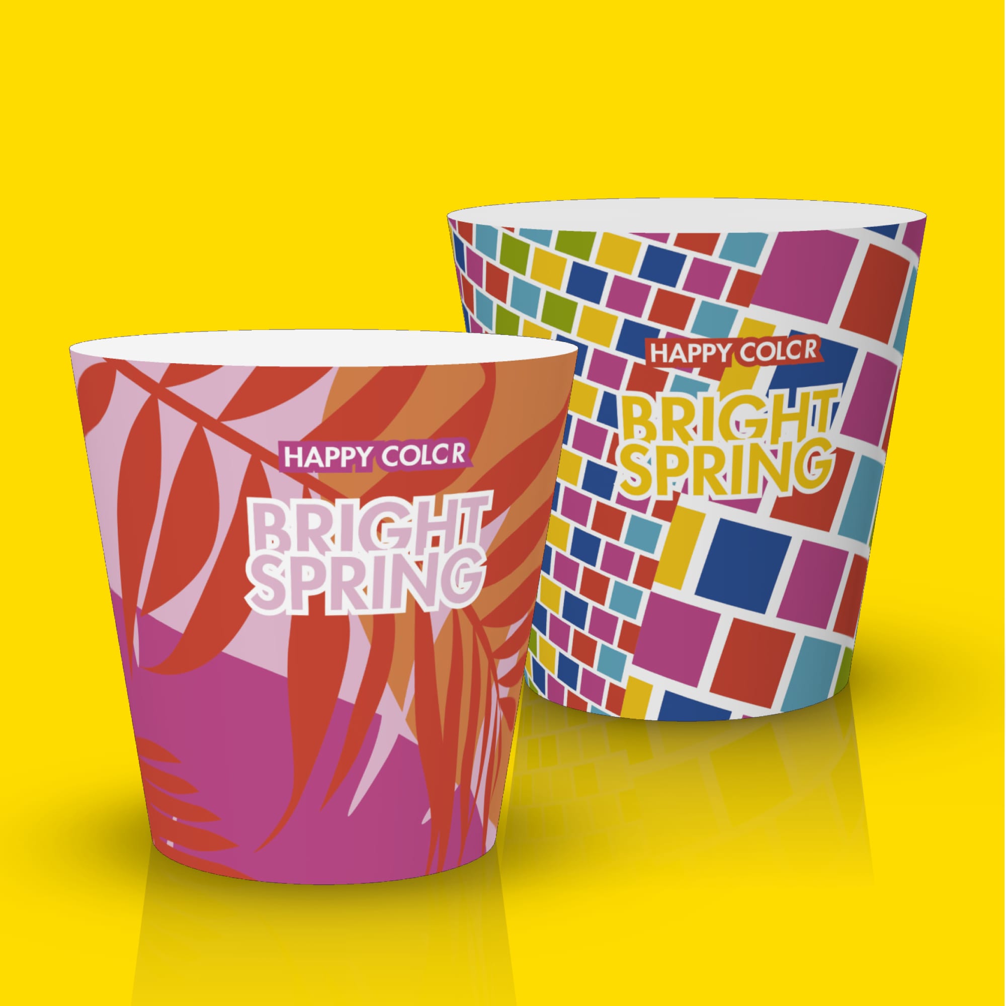
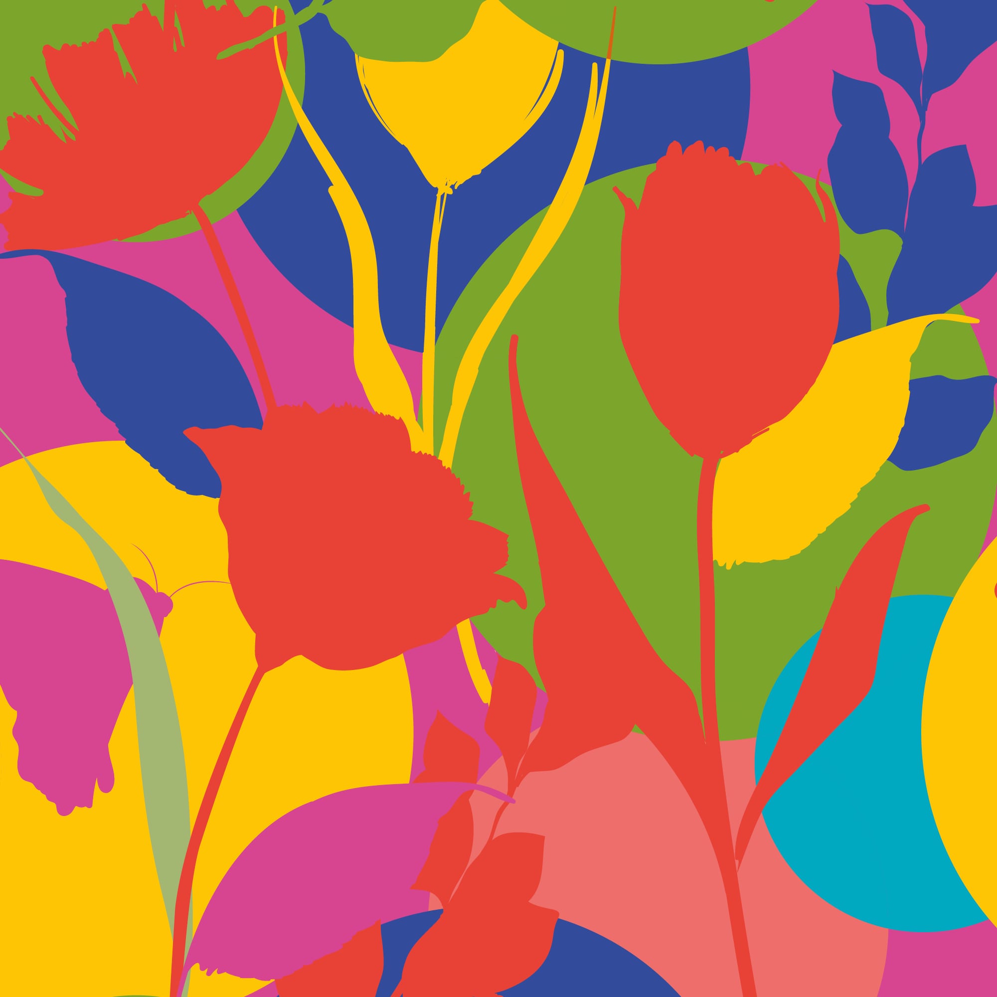
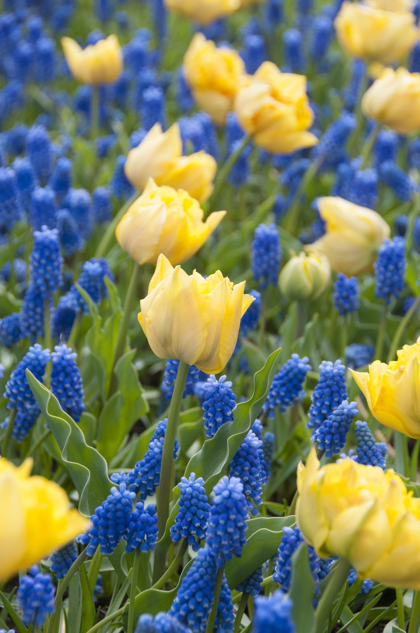
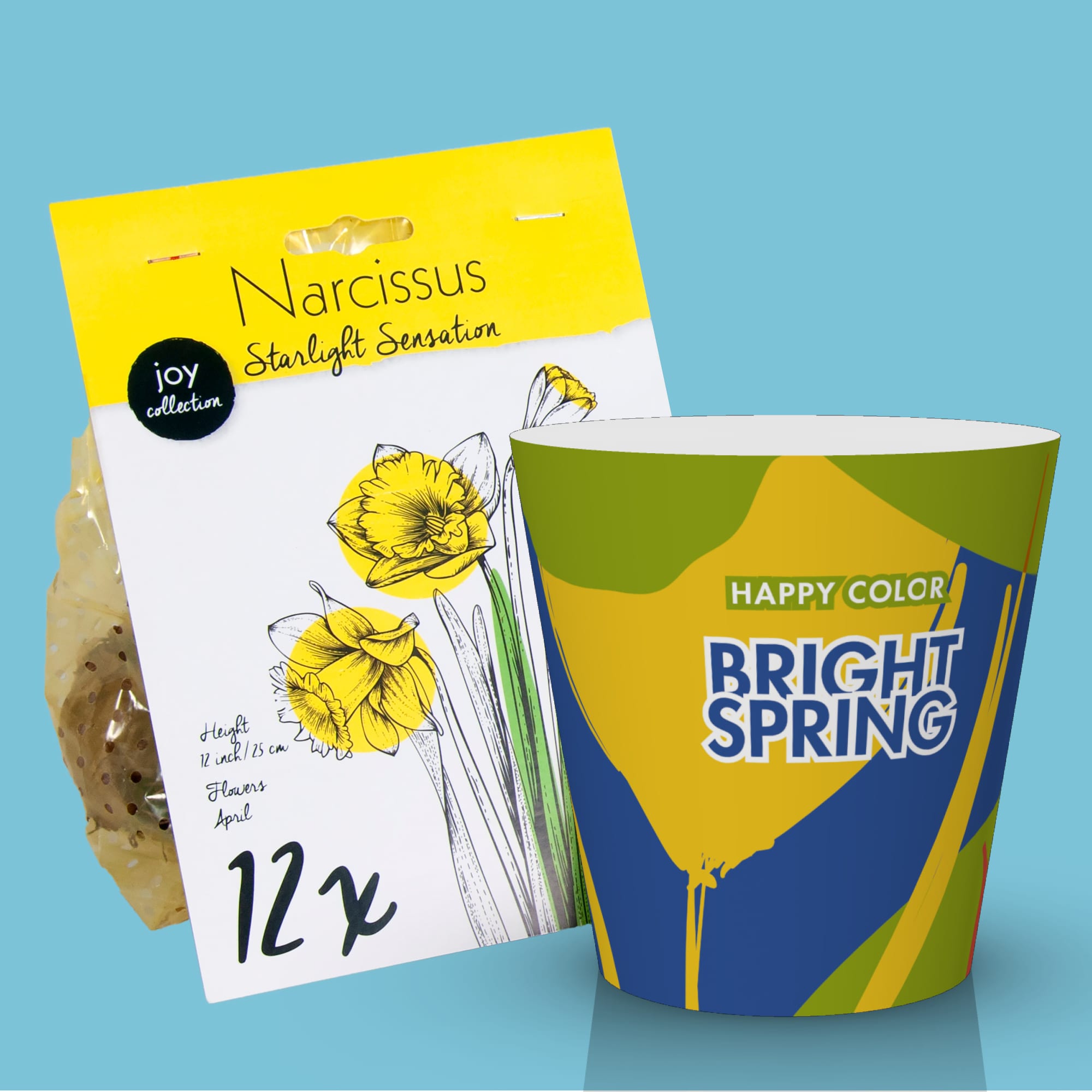
Colorblock
April 2019
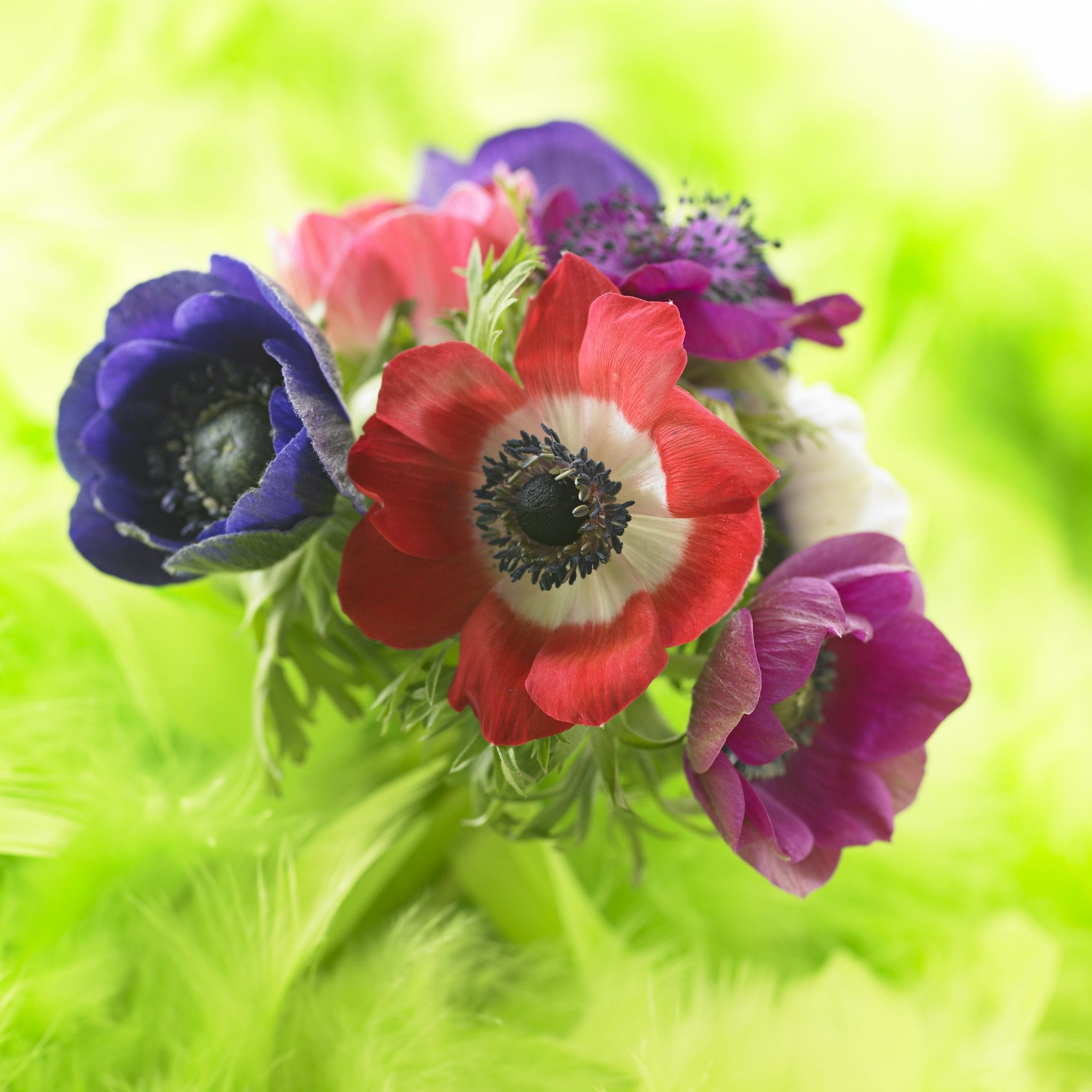
Spring is a time to celebrate: to enjoy the first rays of sunshine, blue skies, birds singing, green meadows, flowers and plants blooming, and relaxing in your garden!
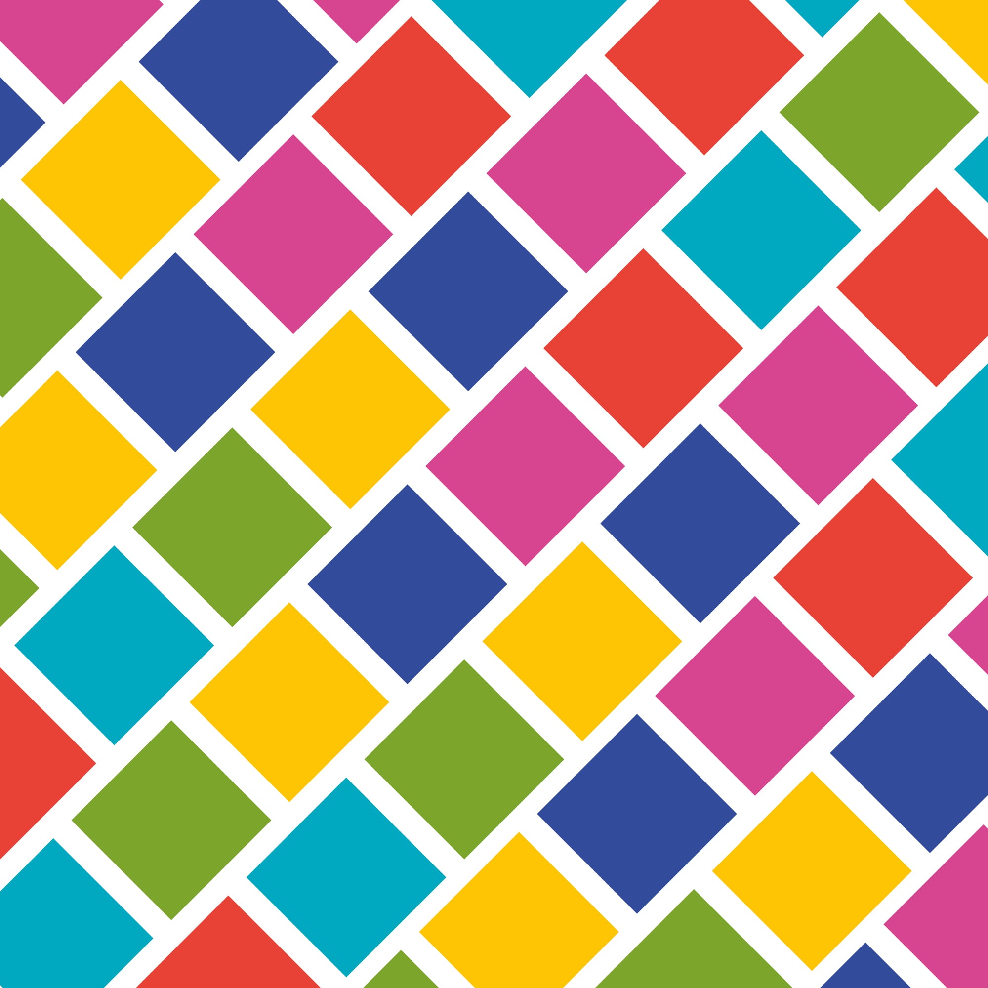
The bright primary colours and the light, blush shades form an eye-catching combination, creating a colourful and upbeat palette that’s sure to get creative juices flowing.
From design and packaging ideas that use primary colours to achieve the right graphic contrast with lighter colours, to a colour palette with a deep link to nature – be inspired by our inspiration Spring: Colorblock.